
Paint Colors Revealed
Our Coastal Dreams project is a fan favorite, and it’s no surprise with blue being one of the most sought after colors used in interior design.

While the grey tones have been popular for the last few years, finding the perfect grey for your space takes careful consideration and coordination of finishes, fabrics, lighting and surrounding materials. One of our favorite grey tones is Sherwin Williams’ Mindful Gray and in this home we chose to use it in a thirty-five percent sheen for the fireplace and surrounding bookshelf millwork. We complimented the soft grey and blue tones throughout the home with trim and millwork in Decorator’s White.

We site tested several whites for the common areas in the home, including the foyer, before finalizing a bright white color we love, called Spare White. With subtle green and blue undertones, the cooler base in this bright white adds unique character with a neutral base that works well in this home which is bathed in natural light. As we transition into the other areas of the home, the light white tones work well within the open floorplan and adjacent spaces.
Blue and brass tones repeat throughout the home, with this show stopping Artistic Tile mosaic setting the tone for the custom built in bar and Subzero wine refrigeration. We complimented the brass accents, cabinet hardware and plumbing with rich cabinetry painted in Storm Cloud.

As we moved into the kitchen, the island cabinetry continues to play on blue’s other strengths, a feeling of security and community. Utilizing the same color as the adjacent wet bar creates beautiful repetition, one of the easiest ways to attain rhythm in an interior design plan. By repeating elements like color and light, they build on the sense of cohesiveness and stability. We strive to achieve this in areas where we gather with our family and friends. Another reason that guests and family alike tend to gravitate to the kitchen.

In this private office, we paired the blue cabinetry with neutral tones and lots of texture; grasscloth wallpaper, wood tones and linen drapes. The perfect space for inspired work and concentration. Studies also show that blue helps humans focus. In this office we used Blustery Sky.

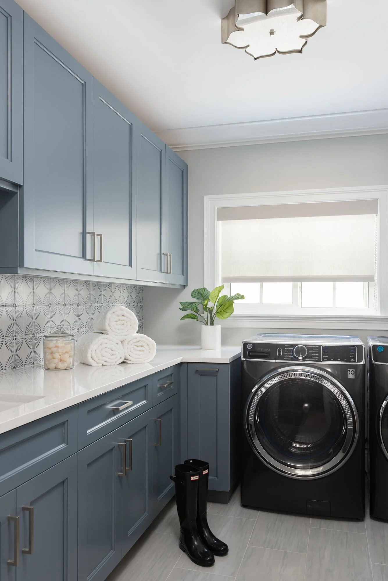
For the cabinetry in this fun downstairs laundry room we used Granite Peak on the cabinetry and Passive on the walls. We love the way the laundry room backsplash, in custom painted tones of white and blue are complimented by the cabinet colors and material selections throughout.
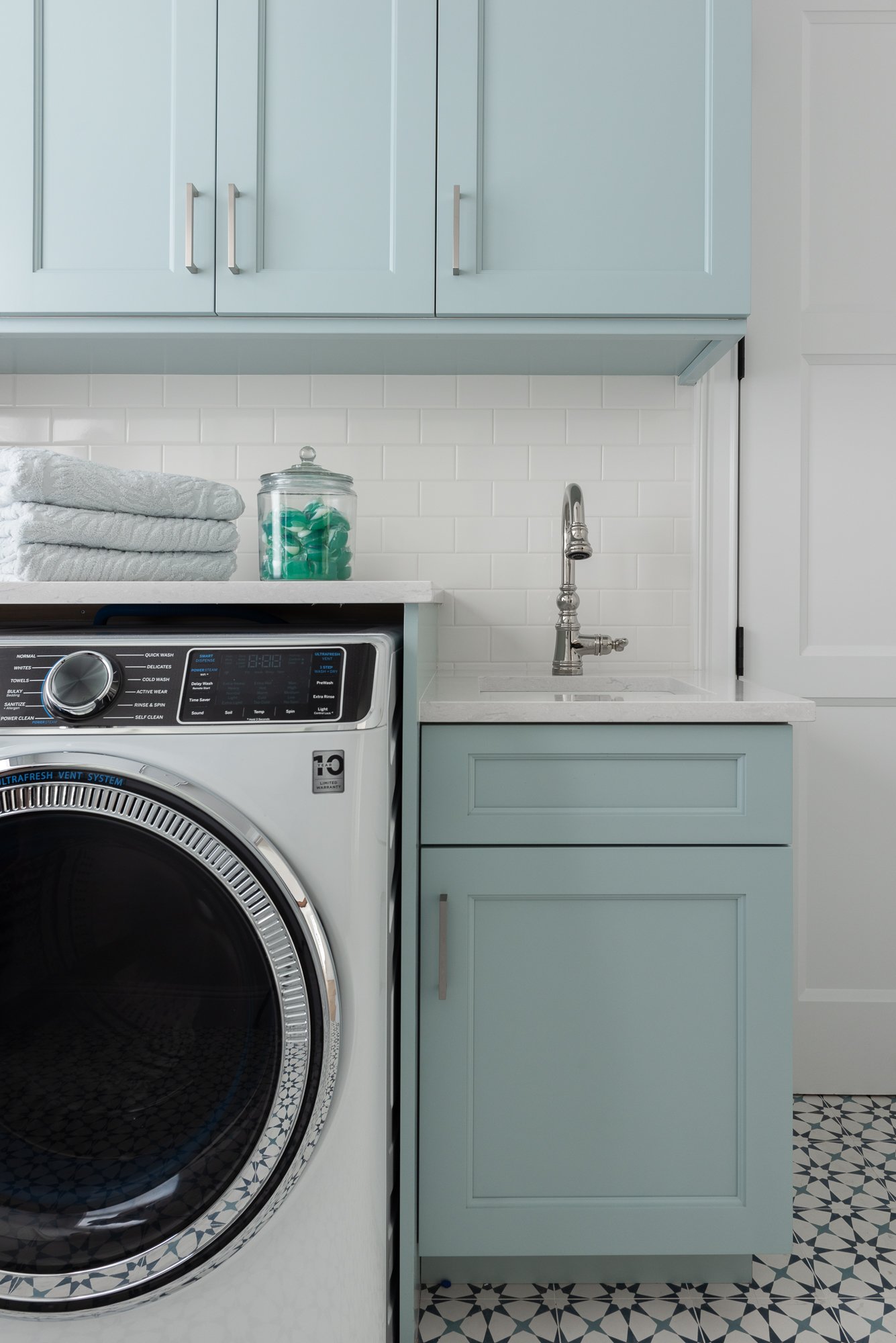
In the upstairs laundry, we used Rain for cabinetry and Reserved White on the walls.
To impart a coastal design aesthetic, the palette continues throughout the home in a cohesive manner from the open areas on the ground floor, to the private rooms and spaces upstairs. The palettes are reflective of the beauty of the natural surrounding coastal environment and were selected to create a calming energy with whimsical pops of color and pattern. The art and accents throughout were chosen with the same design concept in place.
In the kids’ rooms below we opted for more subtle blue tones with Jubilee on the left and Sleepy Blue on the right.


In the kid’s study we went for a deep teal color called Connor’s Lakefront to contrast the textured natural wallpaper.

We used Meditative for this calming guest room perfect for just that, meditating, looking at the beautiful waterfront views, or hosting family and friends,

We hope you gained some helpful insight through our coastal blues project filled with amazing shades of blue. Each room compliments these colors perfectly and you might find a color that suits you.
If you would like to work with our team to help you create a beautiful home or space, fill out or contact form using the link below.