
The Psychology of Color in Interior Design
Color is a foundational element when it comes to interior design. Color psychology is a theory that explains how colors can affect how we think, feel, and act. Something important to think about when putting your home together.

BLUE
Incorporating blue tones in your home can bring tranquility, peace, and productivity. While blue has been a popular color in coastal homes for many years, we find blue to be a fan favorite in many other types of homes as well. Blue can be a quietly unimposing color used to accentuate cool grays and crisp whites or as a cool addition to warm wood tones. It's calming effect can benefit the mind and body and is thought to have healing qualities, as it also works to encourage relaxation.
pink
Pink can add a touch of feminine flair and we’re not just talking about Millenial Pink, which has been gaining confidence in interiors since becoming the Pantone Color of the Year in 2017. Pink looks great with green. Or, as shown in our recent design in progress by Alexia Stalpes pairs perfectly with teal-y blue. Another easy way to add pink is with fresh blooms, which look gorgeous on a living room coffee table. Short stems and a low vase give a modern vibe to these pink carnations.


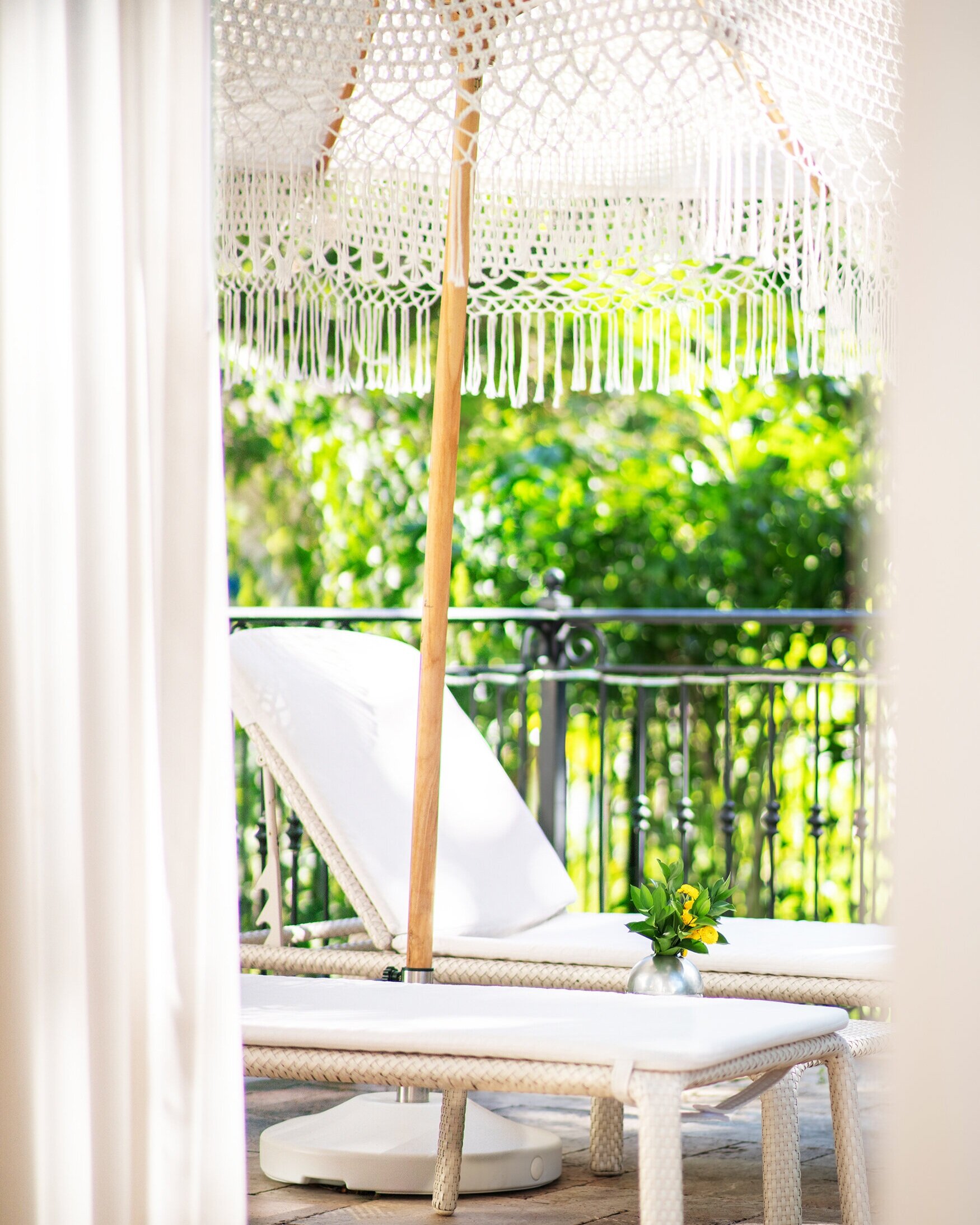
yellow
Yellow is a great color to use as an accent, especially in the kitchen! This bright shade associates with happiness and optimism welcoming in good energy in any space. We love the bold pop of yellow florals against a simple neutral counter top like this quartz by Cambria. Britannica Warm was the perfect counter top for this kitchen. Light and yet warm, the subtle undertones work well with most accent colors.


orange
Tying in a living room with a stimulating orange can really liven up a place. Orange is associated with creativity, attraction, and success. The right amount can bring in some warmth and adventure, and this bold color plays well with neutral tones for the perfect pop in this delightful living room. (Chris James living room). Orange also works as a beautiful and vibrant accent to contrasting deep blues. We designed this playful bedroom for Savvy Giving By Design, , and when Charlie said he loved orange we knew we could make it happen!
green
Green symbolizes growth, calmness, and health. Greenery around your home can add a sense freshness and light. A balanced environment can go a long way toward healing, with studies focussed on biophilic design becoming an important factor when designing for health and wellness. Within the building industry, biophilic design is intended to increase occupant connectivity to the natural environment. This can be done using direct nature, such as placing plants within the designed space as well as indirect nature, such as supporting views to the outside with building placement and window selections. Greenery can also be introduced with murals and imagery, when live plants are not an option.

white and grey
White and grey... such universal colors. Typically associated with cleanliness and elegance, they can really open up a space. Bathroom cabinetry is a beautiful area to try your favourite shade of grey. Grey cabinetry works with most hardware finishes, whether chrome, nickel, black, or our current favorite, brass! Trending for the past few years, and yet very versatile, grey can also create a bold and industrial vibe. The neutral undertones of the many shades of grey, give room to play with almost any other color and texture.
